See also: Culture Silences in Safety – Semiotics
It is unfortunate that some of organisations below didn’t have a better understanding of semiotics when they were in the process of designing their corporate logos – scroll down to see the result but a WARNING – some may be offended, but most will find humorous. I have already primed your thinking about this but imagine the unconscious ideas and reactions of some of their customers!!
Max Geyer spoke about symbols and the unconscious in his article Its All in The Sign where he says:
Making sense of the world around us is facilitated through the recognition and understanding of the meaning of the images, sounds, words, smells, tastes, symbols, actions and objects which make up our surroundings. Although these factors may have the same or different meanings, depending on the standard adopted and how individuals filter them to form their particular model of the world (Chomsky cited in Charvet, 1995, p. 4), they are collectively studied under the discipline of semiotics and are identified as the signs which enable us to think (Chandler, 2007, p. 13).
Before revealing the logos here is a quote from Rob Long’s recent article Semiotics, Semiology and Safety Sense which provides a pretty good intro:
Symbols, colours and words have an identity effect and create comfort or fear and a host of other unconscious psychological effects………..Semiotics tells us that choice of symbols, icons, colours and images are powerful. The work of Jung (Man and His Symbols), Chandler (Semiotics, The Basics) and Ricoeur (The Symbolism of Evil) and many scholars of semiology and semiotics clearly established the power of language and symbols to affect belief, culture and behaviour. It was Ricoeur that stated: ‘man (sic) is a linguistic being” and that it is in and through language that we create and relate meaning. Humans are also social beings and it is through language that we share cultural purpose. So, how easily can invisible ideas and things get into our head and our unconscious?
Latest from Australian Prime Ministers Office (see https://safetyrisk.net/the-wisdom-of-the-beguines-for-safety/ )
Here some corporate logo fails from i100 The Independent and Quora. It is hard to believe that some of these weren’t done on purpose?
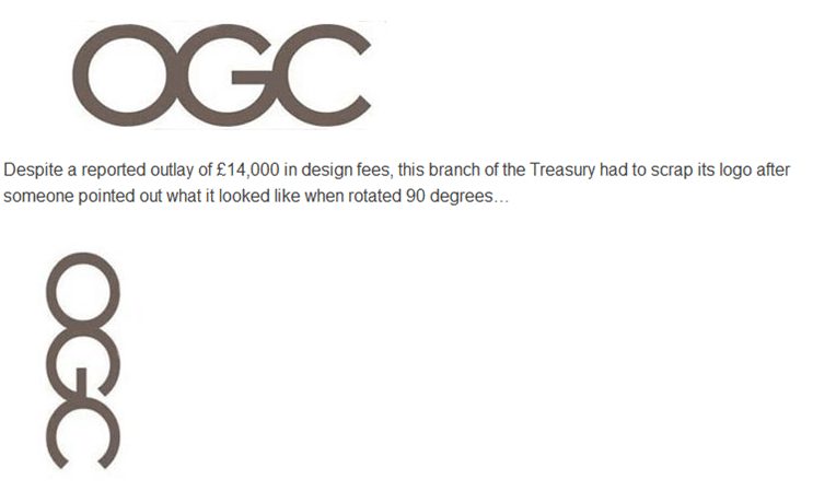
1. Office of Government Commerce
2. The Institute of Oriental Studies, University of Santa Catarina
“Hey, it’s supposed to be a pagoda in front of the rising sun,” we hear the designers say.
3. Arlington Pediatric Clinic
Probably not the most popular pediatric clinic in town.
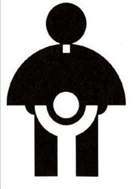
4. Catholic Church’s Archdiocesan Youth Commission
This was reportedly the logo of the youth commission back in 1973.
5. Megaflicks
The video store that wishes it used a different font.
6. Mont-sat
This Polish satellite looks particularly pleased with himself.
7. Junior Jazz Dance Classes
This one might take a while to get. As one commenter notes on Quora: “Focus on the negative space.”
8. State of Vermont pure maple syrup
The kind of syrup no one wants on their pancakes.
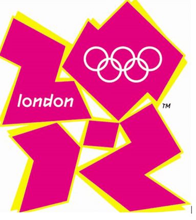
9. 2012 London Olympics
As well as being likened to Lisa Simpson doing something rude, some commenters said the London 2012 Olympics logo looked like a broken swastika. Iran even threatened to boycott the games because they thought it spelled out the word ‘Zion’. The worst part: they spent £400,000 on the design.
10. Suit Yourself
Although not a logo per se, an honourable mention must go to this unfortunate magazine spread.
There are plenty of others:


Do you have any thoughts? Please share them below