The Colour of Safety
It’s been a while since I bought a set of colouring pencils, but I bought a set this week. Oh, you say, that’s not unusual, you probably bought them for your grandchildren? Actually, I bought them, for myself. You will see at the end of this blog what is unique about the pencils but I don’t want to particularly promote them at this part of the blog. There are lots of activities we suspend when we ‘grow up’, things we did in Primary school that we get rid of as ‘childish’ when we move into our teens. One of those activities is ‘play’ and another is the fascination with colour. The truth is we all learn a great deal from ‘play’ (trial and error and experimentation) but we just attribute new names to it.
One of the things we study in the post graduate program is how the unconscious in decision making is affected by social psychological factors. Things like use of space, place, design, size and colour all affect the way we relate to each other and how we make decisions. We call this ‘visual’ and ‘spacial’ literacy and study this in Unit 1. Graphic designers, instructional designers and educators are particularly good at understanding how design, visuals, space, size and colour affect us, marketers and advertisers understand this too. This is why the ‘dumb ways to die’ suicide program went viral, trouble is the message is unethical and therefore unsuccessful.
Colour affects the human mind unconsciously. You can read about it here:
http://www.colour-affects.co.uk/psychological-properties-of-colours
http://www.helpscout.net/blog/psychology-of-color/
http://en.wikipedia.org/wiki/Color_psychology
http://hubpages.com/hub/The-Psychology-of-Color-How-Color-Affects-Human-Behavior
 My first introduction to the importance of colour in influencing decision making was when I read Rhodes and Thame (1988) The Colours of Your Mind in the early 1990s. We were designing a centre for ‘high risk’ young people (homeless, out of school, self harming, abused and abusing, drug addicted, violent etc) and wanted to ensure the space and place was one that would foster positivity, minimize conflict and encourage reflection. The centre was called ‘Galilee’ and later became a registered school and RTO, the centre was funded by the Department of Child Protection. The spaces were designed to minimize distraction and control and worked very well. Rather than have common rooms and large spaces we hade many small buildings and many discreet places. Whilst this made supervision difficult it engendered lots of trust, self control and ownership. The centre was a huge success starting with 2 workers and 8 young people in its first year and was highly sought after to get a place, by the third year with 9 workers and 25-30 young people. I am still in contact with a number of the young people from that program who testify to its success. Unfortunately, some organisations build spaces and place for the convenience of the worker and supervision, that don’t encourage learning but feel more like a prison. It is difficult to buy Rhodes and Thame’s book but I would suggest it as essential for any safety person.
My team and I do spacial, visual and culture audits as part of what we do and it is surprising how many organisations are doing things that communicate (unconsciously) the opposite of what they want to achieve in their safety messages. For example:
I met a safety guy this week for coffee who greeted me dressed in the new company shirt, he works for a tier 2 construction company ($700 mill). The shirt had their new motto (thank god it wasn’t zero harm) that was launched by their new GM safety who had come from a tier one construction company. The logo and motto looked like a street speeding sign and the words were confusing. When I asked him what it all meant he said ‘we should start the day with walking about the job, updating, having conversations and listening’. ‘Why doesn’t your shirt just say that’ I said. He went on to explain that somehow the shirt had to say the word ‘safety’ in it. I took the opposite view, ‘why don’t you make sure the shirt has meaning and leave the word ‘safety’ out. I suggested they just have a logo that said, ‘walk, update, talk and listen’. ‘I think your safety will be much better if you don’t have the word ‘safety’ on your shirt I said. The colour of the shirt was dull with the whole message unconsciously reinforced the idea that safety is dull and unimaginative. Reminds me of the number of times I see safety portrayed by the yellow black safety barrier symbol.
 Isn’t it amazing how safety knows so much about the Act and Regulation but so little of how to communicate it. The Hazardman promotion too is an excellent example of how the ACT Regulator naively promotes the very opposite of safety in this spud head marketing campaign. Here see the tweet of the Regulator congratulating a school child for winning the Hazardman competition that reinforces the idea that you have to be superhuman to spot and rectify a hazard. How strange that the Regulator wants everyone to ‘own’ safety and yet promotes a campaign that promotes only superheroes can manage safety. How strange that the Regulator promotes himself in the cartoon by a character who looks like an absolute dork! (At least the colours and design by the designer are effective)
Unless safety begins to think about what it communicates unconsciously it will continue to contradict the very message it wants to convey. In addition and as a signifier of the Regulators naivety, publishing the name with photo of a school child in the open domain is not that ‘safe’ either. Not only did the Regulator not consult the Education Department about this campaign the regulator beached Department policy regarding identifying children in the open domain. Back to the psychology of colour.
The important thing to remember about the psychology of colour is how it affects us socially. Whilst safety confused behaviourism with psychology, the many unconscious things that effect decisions and behaviour sail under the radar for many in safety. When I wrote about safety being an art this is what I was targeting. Safety needs to step outside the worldview of safety in order to be more effective at safety. Safety is about humans and decision making not just static rules and regulations. When we are able to see the non-conscious (arational) decisions people make we will be less likely to blame them as irrational and more likely to be more purposive and meaningful in the way we communicate safety.
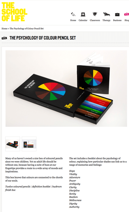
BTW, here is the colouring set I bought, a bit of a ‘trick’ from the School of Life website but nice to put up on my ‘reminder shelf’ in my office so I don’t’ forget about the colours of safety.


Do you have any thoughts? Please share them below